
The PWR report explained in detail: PostgreSQL's AWR, section by section
15 min read
A complete guided tour of the PWR report (the AWR equivalent for PostgreSQL): live banner, snapshot comparison, KPI trends, costly queries, per-query history, locks and automatic recommendations.
Downloadable resources
PostgreSQL has no native AWR: what is the PWR report for?
Oracle has offered the Automatic Workload Repository (AWR) for years: a reference report for diagnosing performance issues by comparing two snapshots of the database's activity. PostgreSQL has never had an official equivalent — PWR fills that gap.
The PWR report follows the same logic: capture regular snapshots of activity (pg_stat_statements, pg_stat_activity, pg_stat_database, pg_settings...), then compare two snapshots to precisely isolate what changed between a "before" and an "after". The result is a document structured into about fifteen sections, oriented toward root cause rather than raw metric collection.
This article walks through, section by section, a real PWR report (benchdb database) so you know exactly what to look at, and in what order, during a diagnosis.
The header and the Live Health Banner
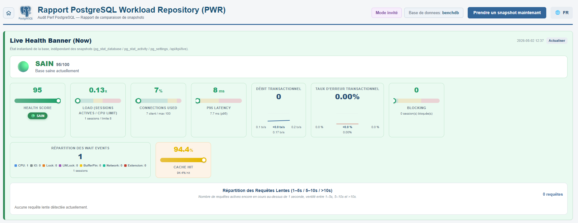
At the top of every page, the navigation bar recalls the context: PostgreSQL logo, title "PostgreSQL Workload Repository (PWR) Report", the currently selected database (here benchdb), a "Take a snapshot now" button to capture the current state without waiting for the next scheduled snapshot, and the language selector.
Just below, the Live Health Banner shows the instant state of the database, independent of historical snapshots (source: pg_stat_database / pg_stat_activity / pg_settings via /api/kpi/live). In the example, the overall health score is 95/100 (HEALTHY status), computed from 5 weighted sub-metrics: Load 30%, Blocking 25%, Connections 20%, P95 15%, Cache 10%.
Shown live: Load (1 active session / CPU limit 8 → 0% of capacity), used connections (7 clients / 100 max), P95 Latency (7.7 ms), transactional throughput (TPS) and error rate, blocked sessions, wait event breakdown (CPU / IO / Lock / LWLock / BufferPin / Network / Extension) and cache hit ratio (94.4%). This banner lets you check at a glance that the database is healthy even before running a snapshot comparison.
Generating a comparison: form and state between the two snapshots
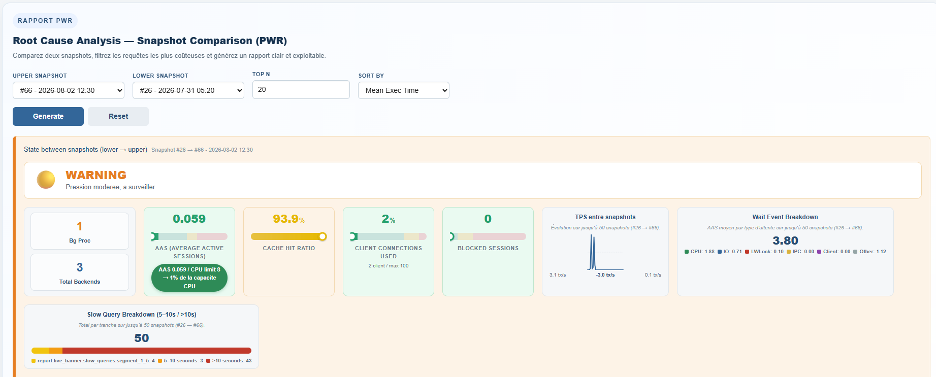
The heart of the tool is the comparison form: you choose an Upper Snapshot (the most recent) and a Lower Snapshot (the oldest) from the history, a Top N (number of queries to show per ranking, 20 by default) and a sort criterion (Mean Exec Time, CPU, Calls, Rows...). The Generate button then produces the full report for that time window.
Right after generation, the "State between snapshots" panel summarizes the overall gap between the two points in time as a severity badge: here WARNING ("Moderate pressure, worth watching") for the period from 07/31 05:20 to 08/02 12:30. The displayed indicators (Bg Proc, Total Backends, AAS, Cache Hit Ratio, client connections, blocked sessions) give a first verdict before even reading the report's details.
Two mini-charts accompany this panel: the TPS trend between the two snapshots, and the average wait event breakdown (here average AAS 3.80, dominated by CPU 1.88 and IO 0.71) as well as the breakdown of slow queries by bucket (5-10s / >10s) — 50 slow queries detected over the period, 43 of which took more than 10 seconds.
Environment summary: the comparison window
The "Database Environment Summary" section unambiguously identifies what is being compared: database name (benchdb), DB Id, PostgreSQL version (18.4 on Ubuntu), host and port. Below it, a Begin Snap / End Snap table gives each snapshot's ID, exact date, number of sessions and active sessions at that moment.
Two key metrics close this section: Elapsed (the real wall-clock duration between the two snapshots, here 430.27 minutes) and DB Time (the cumulative time the database spent processing queries over that period, here 193.96 minutes). Comparing Elapsed and DB Time is a first diagnostic reflex: if DB Time far exceeds Elapsed, it points to heavy parallelism or CPU/IO saturation rather than a simple isolated spike.

Instance technical details: version, OS and memory
A second (detailed) "Database Environment Summary" table completes the technical context: instance name (18/main), server start time (Startup Time), host, port, the full version string (PostgreSQL 18.4, compiled with gcc on Ubuntu), as well as the memory/connection settings from pg_settings: Maxconn (100), Shbuf Mb (shared_buffers, 512 MB), Workmem Mb (4 MB) and Maintmem Mb (maintenance_work_mem, 64 MB).
These values serve as a reference for interpreting the rest of the report: a cache hit ratio that degrades doesn't read the same way depending on whether shared_buffers is 512 MB or several GB.

Active session breakdown by wait class
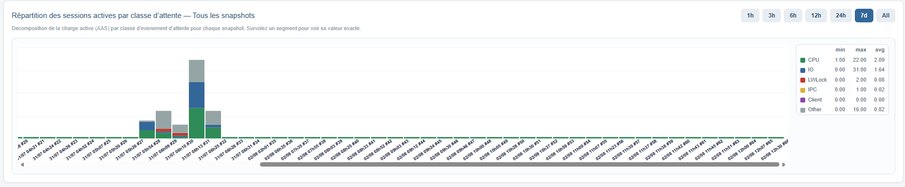
This stacked chart breaks down, snapshot by snapshot, the active load (AAS) by wait event class: CPU (green), IO (blue), LWLock (red), IPC (yellow), Client (purple) and Other (grey). Each bar represents a snapshot; its total height corresponds to the AAS at that moment, and the colors show what the database was actually waiting on.
In the example, an isolated spike is clearly visible (snapshot #31) where AAS far exceeds the average, with a dominant CPU and IO contribution. The min/max/avg table on the right (average CPU 2.09, average IO 1.64, LWLock 0.08...) lets you put that spike into perspective against the database's usual behavior over the period (7 days here). Hovering over a segment shows its exact value.
KPI trends over time: AAS and P95 Latency
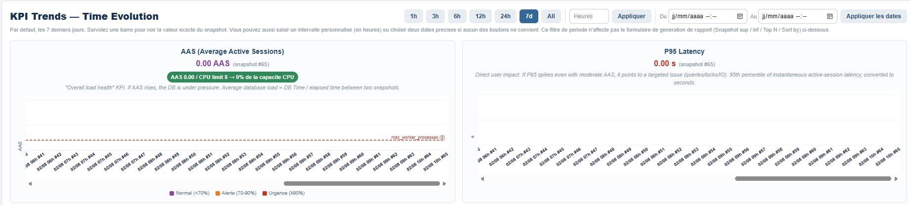
The "KPI Trends — Time Evolution" section plots the evolution of two key indicators snapshot after snapshot, with period shortcuts (1h, 3h, 6h, 12h, 24h, 7 days, All) and the option to enter a custom range or two exact dates.
The AAS chart shows a dashed red threshold line corresponding to max_worker_processes (here 8): as long as AAS stays below this line, the database has headroom; above it, it saturates its available workers. The P95 Latency chart, on the right, shows the 95th percentile of instantaneous latency for active sessions, converted to seconds — the most telling indicator of the impact felt by users.
Slow query trend (5-10s / >10s)
This chart tracks, for each snapshot, the number of active queries still running beyond 5 seconds, split between two buckets (5-10 seconds in orange, more than 10 seconds in red) and a total (purple, dashed).
In the example, an isolated spike is immediately visible around 07/31 at 04-05am, where the number of queries running more than 10 seconds spikes before dropping back to zero — the typical signature of an isolated incident rather than a gradual degradation.

TPS, cache hit ratio, active sessions and connections
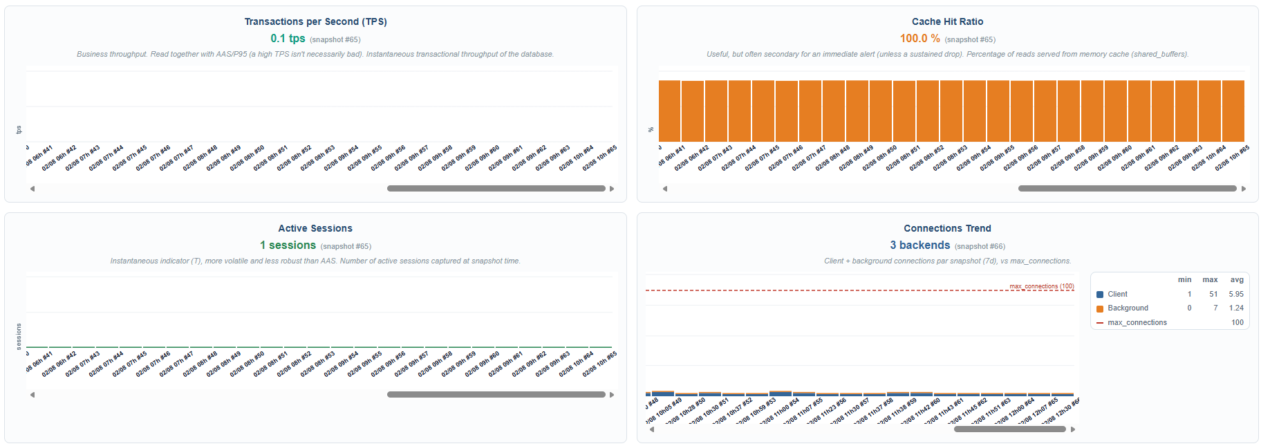
Four mini-charts complete the time-based dashboard: transactional throughput (Transactions per Second), the cache hit rate (percentage of reads served from shared_buffers rather than disk, here stable at 100% over the observed period), instantaneous active sessions, and the connection trend (clients + background) compared against the max_connections ceiling (dashed red line, 100 here).
These four curves let you quickly verify that none of these metrics is silently drifting outside the spikes already identified by AAS and slow queries.
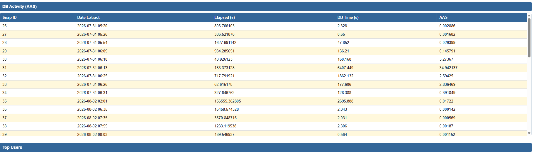
Detailed per-snapshot activity (DB Activity / AAS)
The "DB Activity (AAS)" table lists, snapshot by snapshot, the ID, extraction date, elapsed time (Elapsed), DB Time and AAS computed for that precise interval. This is the raw view behind the earlier charts: it lets you find the exact snapshot ID to select in the comparison form if you want to zoom in on a particular spike (for example snapshot #31, whose computed AAS of 34.94 confirms the spike visible on the wait-class breakdown chart).
Activity delta between the two snapshots (by database and by user)
The "Database Activity Delta (Calls / Time / Rows)" section aggregates, for each database/user combination, the number of calls, cumulative execution time and number of rows processed between the begin and end snapshots. In the example, the user bench_reader executed 67,657 calls on benchdb for 108.76 seconds of cumulative CPU time — most of the activity measured over the period.
This view lets you immediately identify which database/user pair concentrates the load, before even drilling down to the individual query level.

Top Queries: the most expensive queries by execution time
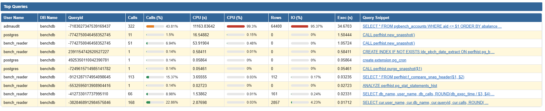
This is the most consulted table in the report: it ranks queries by Mean Exec Time (or by the criterion chosen in the form), with, for each one, its user, database, Queryid, number of calls, share of calls in %, cumulative CPU time and its share in %, number of rows returned, IO share in %, total execution time and a query excerpt (clickable, linking to the full history of that Queryid).
In the example, a single query (SELECT * FROM pgbench_accounts WHERE aid <= $1 ORDER BY abalance ...) literally dominates the ranking: 99.3% of CPU and 95.37% of IO for only 322 calls — the typical signature of an unindexed scan and sort, far more expensive per call than the rest of the traffic.
The "Query History" popup: the execution history of a specific query
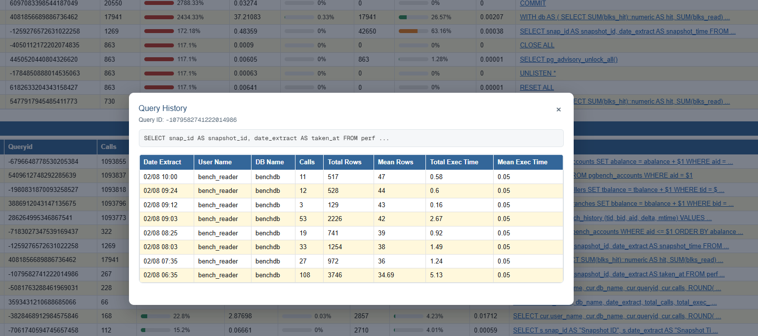
In every ranking table (Top Queries, Top by Calls, Top CPU...), the query excerpt is clickable. Clicking it opens a "Query History" popup showing the relevant Queryid, the full query text, then a table listing every snapshot where that query was captured: extraction date, user, database, number of calls, total/average rows, total and average execution time.
This is the tool that answers the question "did this query suddenly become slow, or is it degrading gradually?". In the example, the query SELECT pg_advisory_unlock_all() is tracked across several readings (from 06:35 to 10:00) with a Mean Exec Time that stays stable around 0.05 seconds — confirming it is not the source of a drift, despite its 267 calls.
This view is especially useful after spotting a suspicious query in a Top Queries table: instead of comparing just two snapshots, it lets you replay the entire execution timeline of that specific query and pinpoint exactly when a regression appeared.
Top Queries by Calls: the most frequent queries
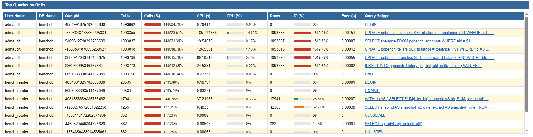
This ranking uses a different criterion: it sorts by call volume rather than unit cost. A query that's cheap to execute (a simple BEGIN, COMMIT or SELECT ... WHERE aid = $1) can represent most of the transactional traffic without ever appearing in the Top CPU.
It is the essential complement to the previous Top Queries: a fast query called millions of times can, cumulatively, weigh as much on the database as a slow query rarely called. In the example, you find the classic pgbench-style workload procession (BEGIN, UPDATE, SELECT, COMMIT) each with several hundred thousand calls.
Top CPU Queries: processor consumption in detail
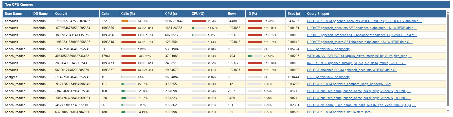
This ranking specifically isolates cumulative CPU consumption per query, independent of the number of calls or total execution time. It answers the question: "if I had to optimize a single query to free up CPU, which one should I choose?"
Unsurprisingly, the same query already identified in the global Top Queries tops the list (SELECT ... ORDER BY abalance), confirming it is indeed the root cause of the CPU pressure observed over the period, and not a statistical artifact from a different sort criterion.
Top Cache Memory & Top Temp Memory: memory pressure and temporary disk
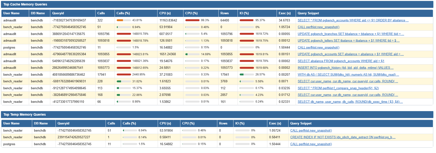
The "Top Cache Memory Queries" table uses the same set of columns to identify the queries that put the most demand on the memory cache (shared_buffers) — useful for spotting a cache hit ratio degradation tied to a specific query rather than global under-sizing.
Right below, the "Top Temp Memory Queries" table lists queries that spill onto temporary disk (sorts or hash joins too large for work_mem): in the example, calls to perfhist.new_snapshot() and index creation appear here, a signal that it may be worth adjusting work_mem or reviewing these occasional maintenance operations.
Top Users, blocking locks and automatic recommendations
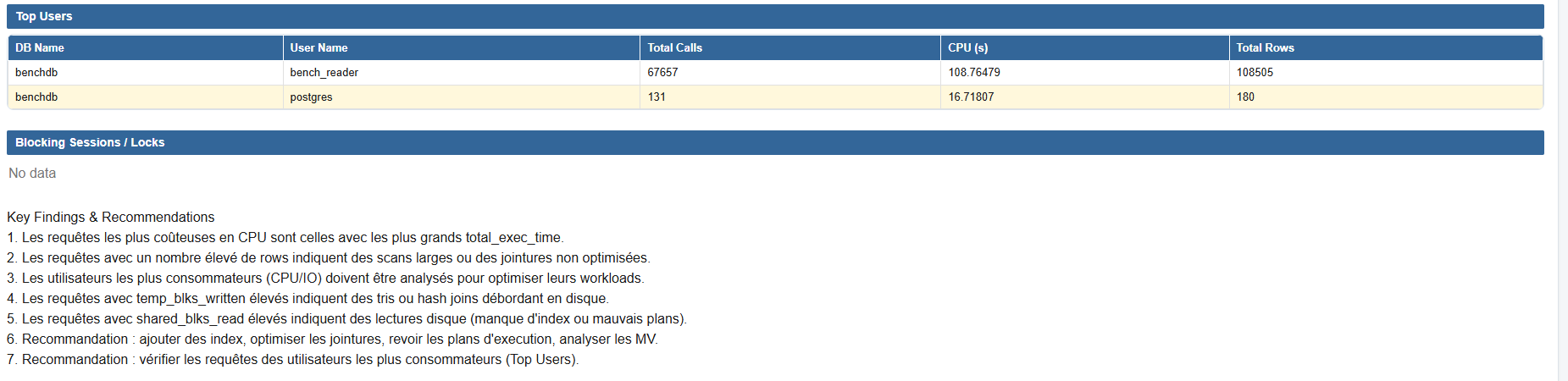
The "Top Users" section aggregates activity by user per database (total calls, cumulative CPU, rows processed) — a shortcut to know which application account or technical role consumes the most resources over the period.
"Blocking Sessions / Locks" lists sessions currently blocked by a lock held by another transaction (empty here, "No data", meaning no contention was in progress at the time of the report). Finally, "Key Findings & Recommendations" automatically translates the metrics into actionable recommendations: queries with high total_exec_time to optimize as a priority, queries returning many rows revealing unoptimized scans or joins, the heaviest-consuming users to audit, queries with high temp_blks_written (sorts/hash joins spilling to disk) and high shared_blks_read (disk reads, missing index or suboptimal plan) to fix, with a reminder to check the associated Top Users.
From reading the report to taking action
Taken in order, these sections follow a logical progression: first check the instant state (Live Health Banner), then quantify the overall gap between two points in time (State between snapshots, Environment Summary), understand where the database was waiting (wait-class breakdown, AAS/P95 trends), drill down to the individual query level (the various Top Queries) to isolate the root cause, and finally check locks and read the automatic recommendations.
The full report used in this article is available for download below in PDF format, for you to explore section by section yourself.
Downloadable resources